What does new World Bank data tell us about progress on poverty?
The World Bank recently released its biggest poverty data updates since 2016. The new data estimates the number of people in poverty as of 2015.
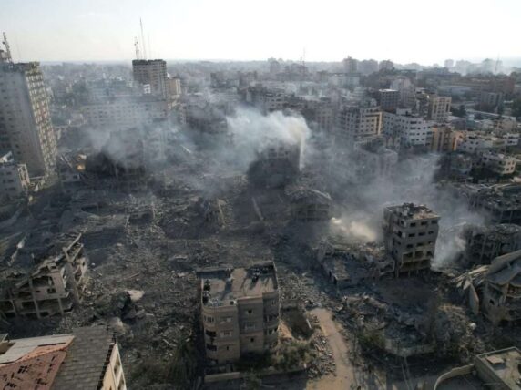
There has been some progress on aggregate and in some countries and regions. However, overall there are many people and places that are making very slow progress or no progress at all, with poverty headcounts increasing in 39 countries from 2013 to 2015.
What are some of the key global trends?
There is some good news: the new numbers show that, globally, extreme poverty (living on less than $1.90 a day) has marginally decreased from 11% of the global population in 2013 to 10% in 2015. For those on $3.20 and $5.50 poverty – two moderate poverty lines introduced by the World Bank in 2016 – progress has been even faster, with a 2.6% and 2.7% reduction respectively since 2013. However, the rate of poverty reduction is the slowest it has been since 1999 and the World Bank predicts further slowing.
Sub-Saharan Africa has seen the most modest reduction in poverty, and an increasing share of the global poor are in Africa. Most other regions in the world did show significant improvements, although figures for South Asia come with a caveat: the World Bank’s methods for estimating poverty in India have changed, leading to revisions of previous estimates.
What do the new numbers tell us about poverty trends at the country level?
39 countries saw extreme poverty headcounts increase from 2013 to 2015. Yemen, Sierra Leone, and Syria saw 24%, 16% and 14% of their populations, respectively, fall into extreme poverty between 2013 and 2015. Burundi, Romania, South Africa, South Sudan, Suriname, and Uganda also saw the percentage of their populations living in poverty increase by 1% or more between 2013 and 2015.
There were some positive trends in key countries with high poverty burdens. Rwanda, Togo, the Democratic Republic of Congo and Tanzania have some of the highest rates of poverty but lifted between 2% and 6% of their populations out of poverty. Generally, though, the trends are clear: Africa’s share of global poverty is increasingly large.
Subscribe to our newsletter
Our weekly email newsletter, Network News, is an indispensable weekly digest of the latest updates on funding, jobs, resources, news and learning opportunities in the international development sector.
Get Network NewsAmong the 30 countries that Development Initiatives has identified as being most likely to be left behind based on a range of factors, the average poverty headcount stayed about the same between 2013 and 2015, at around 48%. Other countries saw their poverty rates drop by 7% on average.
What do the numbers tell us about who might be left behind?
The poorest 20% are making slower progress than everyone else
The people in the poorest 20% of the global population saw their average incomes grow by about $0.09 between 2013 and 2015 from $1.72 to $1.81. Despite these gains, this means that the average person in the poorest 20% continues to live below the extreme poverty line.
Additionally, the average income of the poorest 20% grew at the slowest rate in a decade. The rest of the population saw an increase of around $0.70, taking average incomes to $18.38. In percentage terms, the poorest 20% saw only slightly faster growth than the rest of the population.
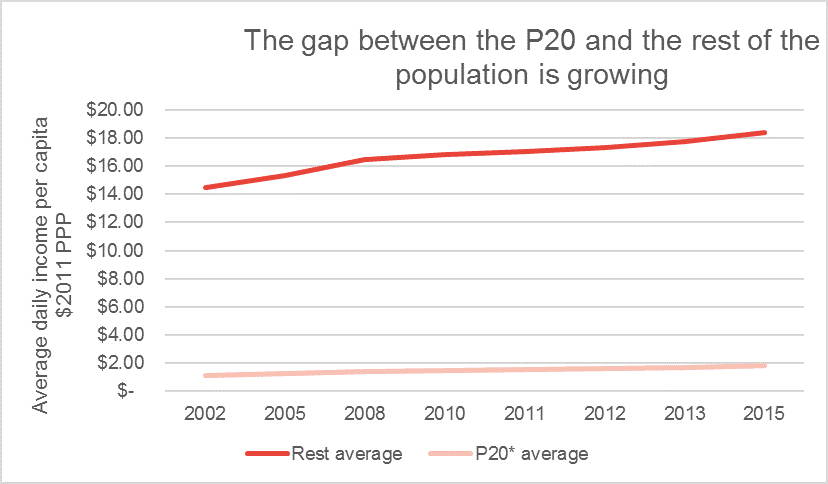
Source: Development Initiatives calculations based on World Bank PovcalNet 2018.
*P20 refers to the poorest 20% of the global population
The incomes of the poorest people have seen a rapid decline since 2008
The World Bank’s revisions to their previous data have altered the consumption floor estimates. As defined by Martin Ravallion, the consumption floor is an estimate of the minimum level of consumption seen at a permanent basis in the population.
In other words, the consumption floor tries to track the incomes of the very poorest people. The past few versions of PovcalNet – the database where the World Bank publishes all its poverty data – suggested that the consumption floor had largely remained within one or two cents of $1.00 in 2011 purchasing power parity (PPP).
The latest updates suggest that there has in fact been more volatility. The poorest people in the world, those who live at the consumption floor, had seen increases in their incomes, which rose from about $0.99 in 1999 to more than $1.04 in 2008.
However, there has been a rapid decline since then with incomes dropping back to $0.99 in 2015. In other words, the poorest people aren’t just staying at the same level of income while everyone else benefits from progress – they are actually seeing their incomes decrease.
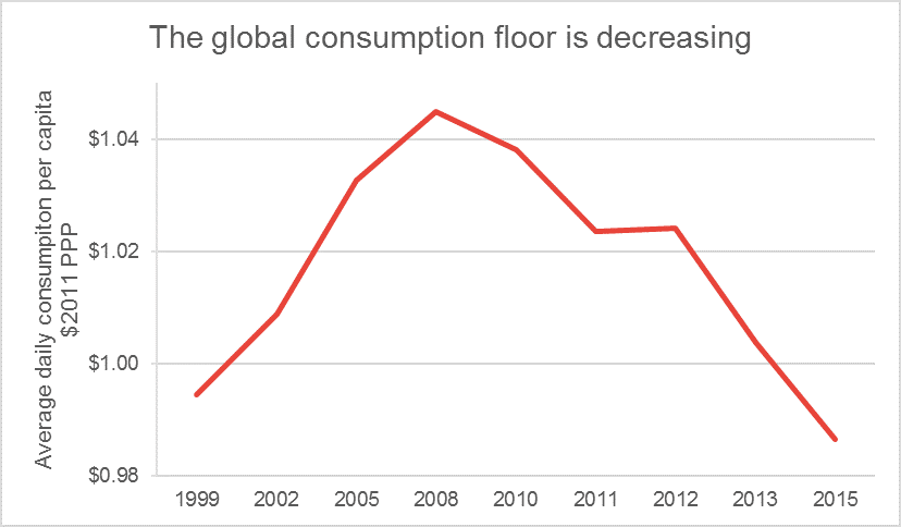
Source: Development Initiatives calculations based on World Bank PovcalNet 2018.
Income growth for the poorest people is lagging and they are likely to be left behind
Viewed from another perspective, we can look at the gains from 2013 to 2015 based on the incomes seen at each point on the global income/consumption percentiles. Doing this creates what was identified by Christoph Lakner and Branko Milanovic [PDF] as an “elephant graph'”. The wealthiest are in the “trunk” where we see a sharp increase among the top percentiles, but overall, those who have seen the highest income growth rates are found around the 50th percentile. For instance, the top 0.1% had a higher growth rate than the bottom 12% globally.
Crucially, the overall distribution demonstrates that while those at the lowest income percentiles in the world may have seen some income growth, they are not seeing the fastest growth in terms either of rates or absolute gains. These populations are likely to be left behind without a significant change in trajectory.
An important caveat to this analysis is that people at the lowest and highest income percentiles generally are not participants in the surveys used for this dataset. It seems plausible that the top 1% has seen substantially higher growth than displayed here.
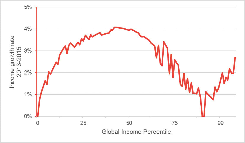
Source: Development Initiatives calculations based on World Bank PovcalNet 2018.
Category
News & Views


